
A Guide to Book Cover Design: Choosing the Perfect Fonts
You've poured your heart and soul into writing a brilliant book, but will readers ever pick it up? Before they read a single word of your story, they read your cover. The right book cover fonts act as a silent salesperson, setting the mood, signaling the genre, and grabbing attention in a crowded marketplace. But with thousands of options, how to design a book cover? This guide will demystify the art of book cover typography, giving you the confidence to choose fonts that not only look professional but help sell your book.
Your journey to a stunning book cover starts with understanding the power of typography. It's more than just letters on a page; it's the visual voice of your story. This guide will equip you with the knowledge to make informed decisions, and you can immediately put these principles into practice when you design a book cover with our intuitive tools.
Understanding Core Book Cover Typography
Before you can choose the perfect font, it's essential to understand the basic categories and the messages they send. Typography is a language in itself, and mastering a few key concepts will dramatically improve your book cover design. These fundamentals are the building blocks of a professional-looking cover that connects with your target audience.
The Psychology of Serif vs. Sans-Serif Fonts
The most fundamental choice in typography is between serif and sans-serif fonts. This decision instantly sets a tone for your book.
-
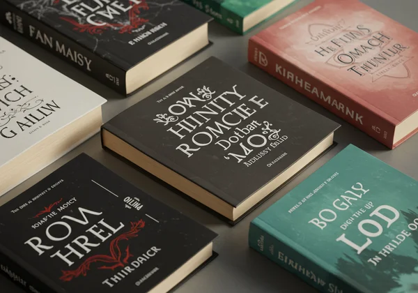
Serif Fonts: These are the classic typefaces with small decorative strokes (serifs) at the end of the letters. Think Times New Roman or Garamond. Serifs convey a sense of tradition, authority, elegance, and history. They are perfect for historical fiction, literary novels, memoirs, and academic non-fiction. The font psychology here suggests stability and respectability.
-
Sans-Serif Fonts: Lacking the small strokes, these fonts (like Helvetica or Arial) have a clean, modern, and minimalist feel. They communicate simplicity, directness, and forward-thinking. Sans-serifs are an excellent choice for contemporary fiction, sci-fi, business books, and thrillers that want to feel current and bold.
When to Use Display and Script Fonts for Impact
While serif and sans-serif fonts are workhorses, display and script fonts are the showstoppers. They are designed to be used in large sizes for titles and headings, not for body text.
-
Display Fonts: This is a broad category of decorative, stylized fonts designed to grab attention. They can be bold, quirky, distressed, or futuristic. They are ideal for creating a strong genre signal on fantasy, horror, or children's book covers. The key is to use them sparingly for maximum impact.
-
Script Fonts: These fonts mimic handwriting, ranging from elegant and flowing calligraphy to casual and personal scrawls. Script fonts are a go-to for romance, women's fiction, and memoirs to evoke a sense of intimacy, emotion, and personality.
Why Font Legibility on Covers is Non-Negotiable
This might be the most important rule of all: your title and author name must be readable. A beautifully artistic font is useless if no one can decipher it, especially when viewed as a tiny thumbnail on an online bookstore. Always check your cover design at a small size to ensure the text is clear and legible. Factors like color contrast, font weight, and spacing all contribute to font legibility and a successful book front cover design.
Choosing the Best Fonts for Your Book's Genre
Readers have subconscious expectations for how a book in their favorite genre should look. Using fonts that align with these expectations acts as a visual shortcut, telling them, "If you like this genre, you'll like this book." This is where market-aware design becomes critical for converting browsers into buyers. Our AI book cover generator is trained on these genre conventions to give you a head start.
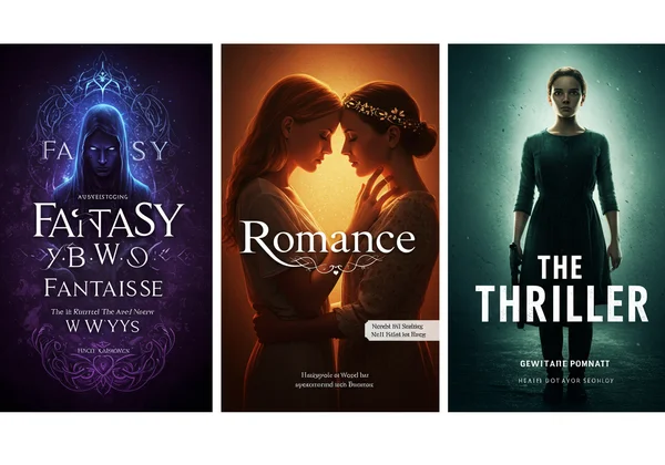
Best Fonts for Fantasy, Sci-Fi, and Dystopian Covers
These speculative genres demand fonts that feel otherworldly and epic.
- Fantasy: Look for serif fonts with a touch of magic, like Trajan or gothic-inspired typefaces (think blackletter styles). Ornate, slightly weathered fonts can suggest ancient lore and high adventure.
- Sci-Fi: Clean, geometric sans-serifs with wide spacing evoke a futuristic, technological feel. Fonts with sharp angles or a blocky appearance work well.
- Dystopian: Distressed, stenciled, or condensed sans-serif fonts are perfect. They create a sense of urgency, rebellion, and societal decay.
Best Fonts for Romance, Contemporary, and Chick-Lit
These genres are all about emotion, relationships, and modern life.
- Romance: Elegant script fonts are the classic choice, suggesting intimacy and passion. For a more modern feel, a light and airy sans-serif paired with a delicate script can be very effective.
- Contemporary & Chick-Lit: Friendly, rounded sans-serifs or charming, handwritten-style fonts work wonders. They feel approachable, relatable, and personal.
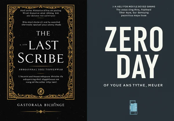
Best Fonts for Thriller, Horror, and Mystery Novels
The goal here is to create tension, suspense, and a sense of unease.
- Thrillers: Bold, condensed sans-serif fonts create a sense of claustrophobia and immediacy. Slightly blurred or glitchy text effects can add to the suspense.
- Horror: Look for fonts that are distorted, grungy, or have an unsettling, scratchy quality. A stark, simple font against a terrifying image can also be incredibly chilling.
- Mystery: Classic serif fonts suggest a traditional whodunit, while sharp, clean sans-serifs can point to a modern crime story or psychological thriller.
Credible Fonts for Non-Fiction and Business Books
For non-fiction, typography must communicate authority, clarity, and trustworthiness.
- Business & Self-Help: Strong, confident sans-serif fonts like Helvetica Neue or Montserrat are a standard. They feel professional, modern, and credible.
- Memoirs & Biographies: A clean serif font often works best, lending a sense of classic storytelling and authenticity.
- History & Academic: Traditional serif fonts are non-negotiable. They convey gravitas and scholarly authority.
How to Pair Fonts on Your Book Cover Design
You rarely use just one font on a cover. The art of designing a book cover often lies in pairing fonts effectively to create a balanced and compelling composition. The goal is to create harmony while establishing a clear visual hierarchy.
The Rule of Two: Combining Fonts for Harmony and Contrast
A simple, effective rule for beginners is to stick to two fonts: one for the title and one for the author's name and any subtitles. The key is to choose two fonts that contrast but also complement each other. A common strategy is to pair a decorative display or script font for the title with a clean, simple serif or sans-serif for the author's name. This creates a clear focal point while ensuring all information is readable.
Creating Visual Hierarchy with Font Size and Weight
Visual hierarchy is about guiding the reader's eye to the most important information first. Typically, the book title should be the most prominent element, followed by the author's name, and then any subtitles or taglines. You can achieve this by manipulating:
- Size: Make the title significantly larger than the other text.
- Weight: Use a bolder version of a font for the title.
- Color: Make the title a brighter or more contrasting color.
How to Create Your Cover with the Perfect Fonts Using AI
Now that you understand the principles of choosing and pairing fonts, you might feel overwhelmed. This is where technology becomes your most powerful ally. Instead of spending hours searching for fonts and struggling with complex design software, you can leverage an AI tool to do the heavy lifting.
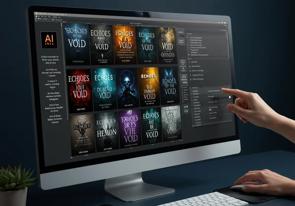
Our AI book cover generator simplifies the entire process. You can input your book title, select a genre-specific style, and our AI will generate multiple professional book cover design ideas, complete with appropriate font pairings and layouts. You can easily experiment with different options, fine-tuning the results until they perfectly match your vision. It’s the easiest way to apply design theory and create your cover in minutes.
The right font does more than spell out your title—it sells your story. You now have the typographic knowledge to make strategic choices that resonate with your genre and attract readers. Stop letting design stand in your way. Visit our AI book cover generator to take these principles and instantly create the professional, compelling cover your book deserves.
Your Book Cover Design Questions, Answered
What makes a good book cover design?
A good book cover design achieves three things: it grabs attention, it clearly communicates the book's genre and mood, and it features a legible title and author name. It must be effective both as a full-size image and as a small online thumbnail. The combination of compelling imagery, strategic color choices, and appropriate typography is key to a successful design.
How do I choose a font if my book crosses multiple genres?
This is a great question for authors of genre-bending stories. The key is to identify the primary genre you are marketing to. Choose a font that aligns most closely with that dominant genre. You can then use secondary elements, like color or imagery, to hint at the other genres. For example, a sci-fi romance could use a clean sans-serif font (for sci-fi) in a color palette associated with romance (pinks, reds, or soft pastels).
Can I use AI to help me design a professional book cover?
Absolutely. Using an AI tool is one of the most efficient and cost-effective ways to get a professional book cover design. Our AI-powered cover design tool is designed specifically for this purpose. Its AI understands genre conventions, design principles, and font pairing, allowing authors to generate dozens of high-quality, unique book cover design options instantly, without needing any prior design skills.